AI/ML Enhancement Project - Exploratory Data Analysis User Scenario
Introduction
Exploratory Data Analysis (EDA) is an essential step in the workflow of a data scientist or machine learning (ML) practitioner. The purpose of EDA is to analyse the data that will be used to train and evaluate ML models. This new capability brought by AI/ML Enhancement Project will support users in the Geohazards Exploitation Platform (GEP) and Urban Thematic Exploitation Platform (U-TEP) to better understand the dataset structure and its properties, discover missing values and possible outliers, as well as to identify correlations and patterns between features that can be used to tailor and improve model performance.
This post presents User Scenario 1 of the AI/ML Enhancement Project titled “Alice does Exploratory Data Analysis (EDA)”. For this user scenario, an interactive Jupyter Notebook has been developed to guide an ML practitioner, such as Alice, implement EDA on her data. The Notebook firstly introduces the connectivity with a STAC catalog interacting with the STAC API to search and access EO data and labels by defining specific query parameters (we will cover that in a dedicated article). Subsequently, the user loads the input dataframe and then performs the EDA steps for understanding her data, such as data cleaning, correlation analysis, histogram plotting and data engineering. Practical examples and commands are displayed to demonstrate how simply this Notebook can be used for this purpose.
Input Dataframe
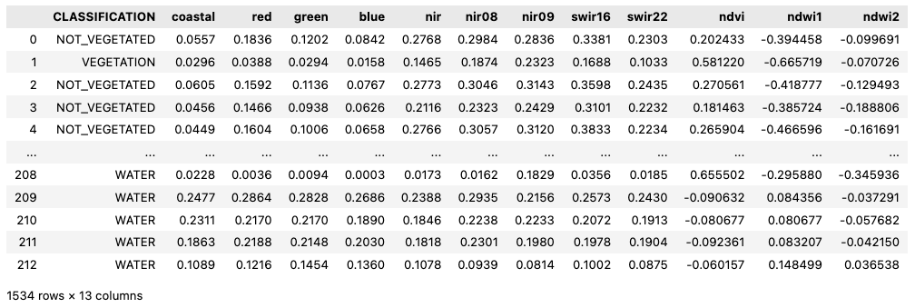
The input data consisted of point data labelled with three classes and features extracted from Sentinel-2 reflectance bands. Three vegetation indices were also computed from selected bands. The pre-arranged dataframe was loaded using the pandas library. The dataframe is composed by 13 columns:
- column CLASSIFICATION: defines the land cover classes of each label, with available classes
VEGETATION,NOT_VEGETATED,WATER. - columns with reflectance bands: extracted from the spectral bands of six Sentinel-2 scenes: coastal, red, green, blue, nir, nir08, nir09, swir16, and swir22.
- columns for vegetation indices, calculated from the reflectance bands: ndvi, ndwi1, and ndwi2.
A snapshot of how the dataframe can be loaded and displayed is shown below.
import pandas as pd
dataset = pd.read_pickle('./input/dataframe.pkl')
dataset
This analysis focused on differentiating between “water” and “no-water” labels, therefore a pre-processing operation was performed on the dataframe to change the classification of VEGETATION and NOT_VEGETATED labels as “no-water”. This can be quickly achieved with the command below:
LABEL_NAME = 'water'
dataset[LABEL_NAME] = dataset['CLASSIFICATION'].apply(lambda x: 1 if x == 'WATER' else 0)
Data Cleaning
After loading, the user can inspect the dataframe with the pandas function dataset.info() to show a quick overview of the data, such as number of rows, columns and data types. A further statistical analysis can then be performed for each feature with the function dataset.describe(), which extracts relevant information, including count, mean, min & max, standard deviation and 25%, 50%, 75% percentiles.
dataset.info()
dataset.describe()
The user can quickly check if null data was present in the dataframe. In general, if features with null values are identified, the user should either remove them from the dataframe, or convert or assign them to appropriate values, if known.
dataset[dataset.isnull().any(axis=1)]
Correlation Analysis
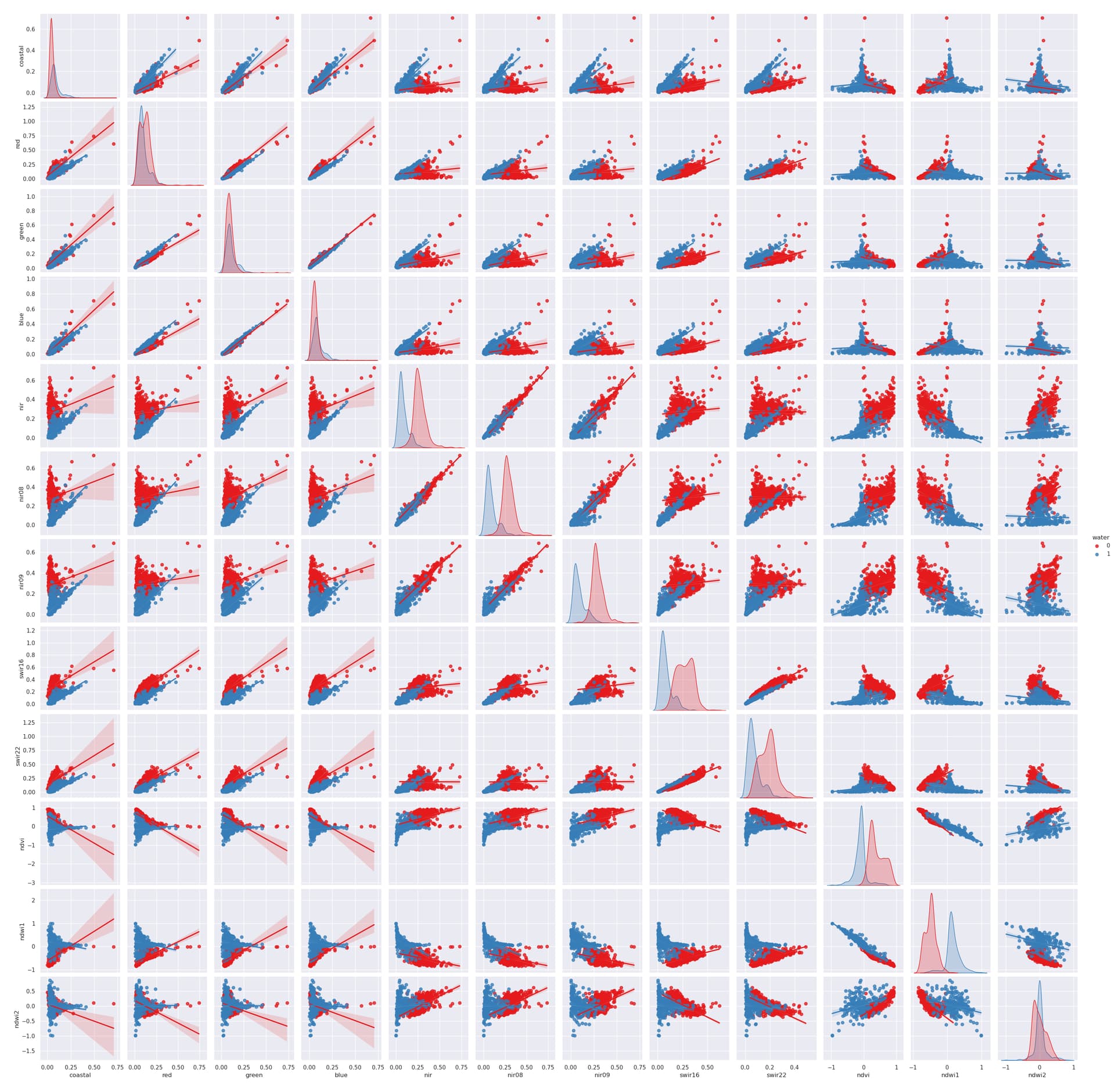
The correlation analysis between “water” and “no-water” pixels for all features was performed with the pairplot() function of the seaborn library.
import seaborn as sns
sns.pairplot(dataframe, hue=LABEL_NAME, kind='reg', palette = "Set1")
This simple command generates multiple pairwise bivariate distributions of all features in the dataset, where the diagonal plots represent univariate distributions. It displays the relationship for the (n, 2) combination of variables in a dataframe as a matrix of plots, as depicted in the figure below (with ‘water’ points shown in blue).
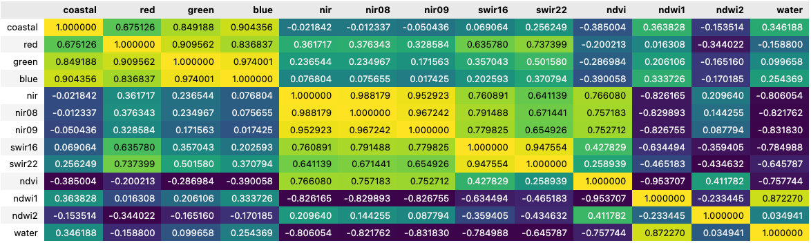
The correlation between variables can also be visually represented by the correlation matrix, simply generated by the seaborn corr() function (see figure below). Each cell in the matrix represents the correlation coefficient, which quantifies the degree to which two variables are linearly related. Values close to 1 (in yellow) and -1 (in dark blue) respectively represent positive and negative correlations, and values close to 0 represent no correlation. The matrix is highly customisable with different format and colour maps available.
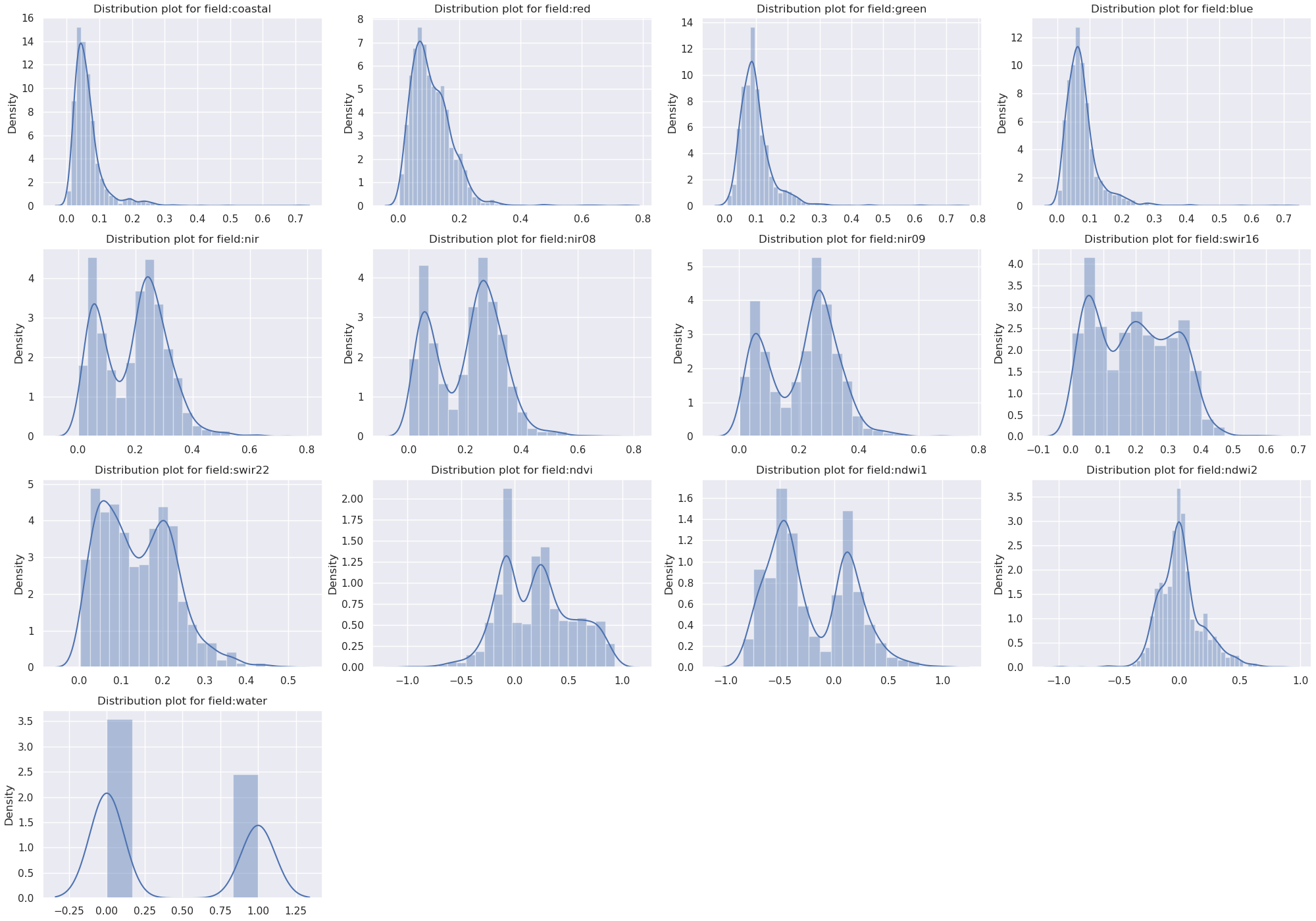
Distribution Density Histograms
Another good practice is to understand the distribution density of values for each column feature. The user can target specifically the distribution of specific features when related to the corresponding label “water”, plot this over the histograms, and save the output figure to file.
import matplotlib.pyplot as plt

for i, c in enumerate(dataset.select_dtypes(include='number').columns):
   plt.subplot(4,3,i+1)
   sns.distplot(dataset[c])
   plt.title('Distribution plot for field:' + c)
   plt.savefig(f'./distribution_hist.png')
Outliers detection
The statistical analysis and histogram plots provide an assessment regarding the data distribution of each feature. To further analyse the data distribution, it is advised to conduct a dedicated analysis to detect possible outliers in the data. The Tukey IQR method identifies outliers as values with more than 1.5 times the interquartile range from the quartiles — either below Q1 − 1.5 IQR, or above Q3 + 1.5 IQR. An example of the Tukey IQR method applied to the NDVI index is shown below:
import numpy as np

def find_outliers_tukey(x):
   q1 = np.percentile(x,25)
   q3 = np.percentile(x,75)
   iqr = q3 - q1
   floor = q1 - 1.5*iqr
   ceiling = q3 + 1.5*iqr
   outlier_indices = list(x.index[(x<floor) | (x>ceiling)])
   outlier_values = list(x[outlier_indices])
   return outlier_indices,outlier_values

tukey_indices, tukey_values = find_outliers_tukey(dataset['ndvi'])
Feature engineering and dimensionality reduction
Future engineering can be used when the available features are not enough for training an ML model, for example when a small number of features is available, or it is not representative enough. In such cases, feature engineering can be used to increase and/or improve the dataframe representativeness. In this case it was used the PolynomialFeatures function from the sklearn library to increase the number of overall features through an iterative combination of the available features. For an algorithm like a Random Forest where decisions are being made, adding more features through feature engineering could provide a substantial improvement. Algorithms like convolutional neural networks however, might not need these since they can extract patterns directly out of the data.
from sklearn.preprocessing import PolynomialFeatures

poly = PolynomialFeatures(interaction_only=True, include_bias=False)
new_dataset = pd.DataFrame(poly.fit_transform(dataset))
new_dataset
On the other hand, Principal Component Analysis (PCA) is a technique that transforms a dataset of many features into fewer, principal components that best summarise the variance that underlies the data. This can be used to extract the principal components from each feature so they can be used in training. PCA is also a function offered by the sklearn Python library.
from sklearn.decomposition import PCA

pca = PCA(n_components=len(new_dataset.columns))
X_pca = pd.DataFrame(pca.fit_transform(new_dataset))
Conclusion
This work demonstrates the new functionalities brought by the AI/ML Enhancement Project with simple steps and commands a ML practitioner like Alice can take to analyse a dataframe for the preparatory step of a ML application lifecycle. Using this Jupyter Notebook, Alice can iteratively conduct the EDA steps to gain insights and analyse data patterns, calculate statistical summaries, generating histograms or scatter plots, understand correlation between features, and share results to her colleagues.
Useful links:
- The link to the Notebook for User Scenario 1 is: https://github.com/ai-extensions/notebooks/blob/main/scenario-1/s1-eda.ipynb.
Note: access to this Notebook must be granted - please send an email to support@terradue.com with subject “Request Access to s1-eda” and body “Please provide access to Notebook for AI Extensions User Scenario 1”; - The user manual of the AI/ML Enhancement Project Platform is available at AI-Extensions Application Hub - User Manual.